
A First
Look at the
JPEG2000 Standard

|
[ JPG
vs LWF 100% screen size ] - [ JPG vs
LWF 200% screen size ] - [ LWF at different
compressions ]
[ Animated comparison ] - [ Technical
comparison ]
|
|
The interest of this
comparison lies in the fact that various interests have attempted
to find a new compression scheme for the internet. None has been
able to impose its own standard. The JPEG2000 group was organized
to create a new standard for all, to supercede the older JPG
standard. The LWF (Luratech) file standard, using the new "wavelet"
compression, closely resembles the upcoming JPEG2000 standard,
which in fact incorporates many of Luratech's wavelet formulas.
It can be safely assumed that the new standard will closely resemble
what Luratech now produces.
The screen captures
below show details of an image at full screen size. The original
image is an uncompressed TIF. The images used to illustrate this
page are, of course, compressed too. But I have carefully limited
the compression so that no additional compression artifacts are
visible in this comparison. |
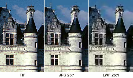
TIF,
JPG and LWF at 100% screen size
At left, detail
of the original TIF image.
Note detail in the stonework, clean
sky effects. |
Center, the same
detail in a JPG file compressed 25 times in Smartsaver. Blockiness
visible in the sky, detail remains good. |
At right, the
new LWF format. The file has been compressed 25:1 which yields
a filesize like that of the JPG. Detail suffers. |
|
In the images above,
at real screen size, you will note that the JPG file, at 57KB,
keeps noticeably better detail in the stonework but introduces
noise and blockiness. The new LWF format yields, for an equal
filesize, a much cleaner picture, but loses more of the fine
detail. The compression ratio for both the JPG and the LWF files
is exactly 24.9:1 (almost 25:1, but not quite). While the filesize
is dramatically reduced, there is also a degradation of image
quality. There's no getting around that for now. You win some,
you lose some. It appears to be a tradeoff. |
 |
TIF,
JPG and LWF at 200% screen size
The screen captures
below show details of an image at
twice normal screen size. This small
degree of magnification clearly shows the differences between
a good JPG compression algorithm (in ULead Smartsaver) and the new LWF compression
developed by LuraTech.
Both the JPG and the LWF files are compressed at a level of 25:1
compared to the original uncompressed TIF image at left. It is
clear that the new compression scheme greatly reduces the formation
of false color and block artifacts (see an example of JPG artifacts
in the sky near the roofline and in the clouds in the center
image below), but at the cost of much lost detail.

|
LWF
at different rates of compression
The mosaic below show details of the same image at different
levels of compression.
This is essentially the same detail seen in the first set of
images on this page (you can refer to that set of images to see
a JPG sample).
I have not included a sample of the "lossless" LWF
compression, which reduces the filesize by approximately one
third. I have focused on compressions and small file sizes. The
details below are each approximately 140 pixels wide and 230
pixels high and are seen full size, 100%, as they would display
in a browser. The numbers displayed for each image are
- the actual filesize
for each original element of the mosaic below
- the compression setting
in the Luratech software

|
2 KB |
968 bytes |
484 bytes |
340 bytes |
Comparison
of JPG and LWF - Animated files
The file below is
159KB in size and shows a small detail of the larger image that
will display below it. It cycles through four frames, five seconds
apiece, showing JPG and LWF files on the same frame, displayed
in real screen size, at four different and successive levels
of compression.

This next image is
quite large, 722KB. It cycles slowly through nine different versions
of the same image: the original uncompressed TIF, then JPG and
LWF at 5:1, 10:1, 20:1 and 50:1 compression ratios. Each image
is clearly marked. Be aware that all of these images have had
to be transformed to the GIF format for this animation. This
introduces some dithering (dot patterns) to the images, but the
overall effect of each compression scheme is still plain to see.
If you would like the animation to be slower, please e-mail me and I will slow it to 4 or
5 seconds a frame. (Right now it displays a frame every three
seconds).

A highly detailed
technical comparison of various JPG compression algorithms and
the new wavelet compression scheme will be posted shortly. It
will be lavishly illustrated and will clearly show the strengths
and weaknesses of each scheme. A link to this comparison, which
was organized by Alex Karasev, will be posted here, probably
by January 16 or 17, 2000.

--
page updated January 07, 2000 --
© Robert
Jeantet,
Le Serveur Savoie
You are
visitor number (more
or less) to a Serveur Savoie page
since a certain amount of time.
|